
I’ve been a fan of the Tour de France for many years. I’ve always been a keen cyclist but as a mountain biker the tactical and physical magnificence of the Grand Tours had always eluded me. It wasn’t until British Cycling’s wave of success swept the nation along that I began to take an interest in ‘Le Tour’.
It wasn’t only the latest and greatest cyclists that captivated me; the history of the event was long, rich and full of legends. The world of cycling has long discussed who is the ‘greatest’ so I don’t want to spend too much time speculating on this. However, there are a huge number of statistics which can be explored in an event that has run for over 100 years.


_(cropped)")
The Tour has had a long history
The Tour de France’s official website has an excellent facility which gives in-depth detail regarding any particular year of the event. (I implore you to visit it to get a better idea of the information which is available). Ever since setting eyes on this treasure trove of information, it has been an ambition to start to visualise some of the numbers on offer — plot, chart and sketch the stories behind these stats.
Earlier this year, I learnt to use a new tool and I was able to start extracting the data from the website, storing it in a large database. I’ve begun to create a series of graphs, maps and visualisations to explore different aspects of this prestigious race.
You can visit the dashboards I’ve created by clicking the image below. There are a number of different visualisations to explore. I’ve tried to make it as intuitive as possible to understand and navigate but I’ve also included some descriptions below. These are best viewed on a desktop or tablet.
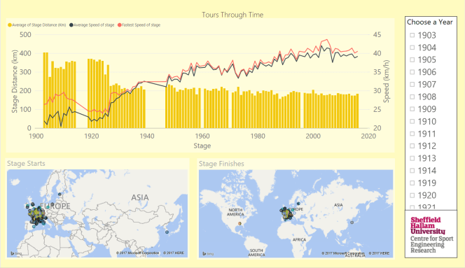
Tours Through Time
The first dashboard explores the average speeds of the tour through time. It also shows the start and finish points of each stage for a particular year (although the mapping function is a little shaky, if it appears a stage started somewhere in Eastern Europe and finished in the South of France, I’d ignore it).
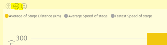
To look at a particular year I recommend the following, click on a year on the list to the right and on the top plot you should be able to ‘drill down’ by clicking the double arrow icon (as below). This will allow you to see the individual speeds and lengths of each stage.
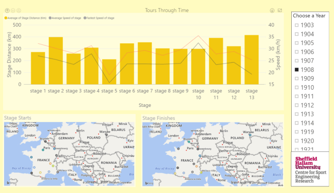
(Please note the years missing in the 1960s are due to errors on the TdF website)
The Fight For Yellow
I had high hopes for this dashboard but it’s unfortunately a bit hit and miss. I’d hoped to illustrate close battles for the yellow jersey over time. Unfortunately the website doesn’t contain full data for all riders and all years so this only really works from about 1997 onwards. To compound there this issue there are a number of years in the early 2000s when there was no official winner.
The dashboard has two sections. The bottom section shows the years of the tour, each in a square. The larger the size of the square the greater the time gap at the end of the race. The greener the square the more riders held the yellow jersey during the race (you can see exact numbers by hovering over a square).
The top section shows the progression of the stage, the line is the cumulative time difference between (the eventual) first and second place. The bars represent the time lost or won by the (eventual) winner on that stage. The snapshot below shows the 2011 Tour when Cadel Evans lost time in the final mountain stage before taking the victory in a time trial the following day.
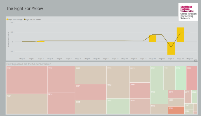
You’ll have to excuse the missing data in this dashboard, I hope to improve it with time.
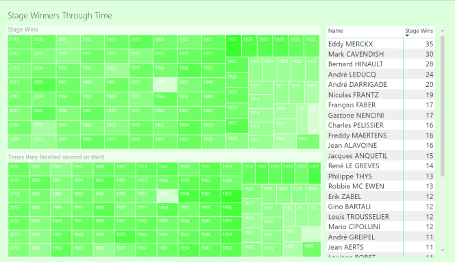
Stage Winners Through Time
This dashboard shows the most prolific stage winners in the tours history. Click on a name and you can see when they were most dominant as illustrated by the squares representing years of the tour (the darker the green the greater the number of stage wins). The similar plot at the bottom of the dashboard shows the times they were 2nd or 3rd in a stage.
Again, this dataset contains errors so I apologise for discrepancies in the data, this is primarily a visualisation exercise!
Riders that have never won The Tour but have spent time in the Yellow Jersey
The final dashboard (for now) shows the riders who have only enjoyed fleeting glory. They have spent time as the race leader but never won the race overall. In a similar fashion to the stage winners dashboard, click on a name to see the years that rider competed. The darker the yellow the better the overall finishing position. 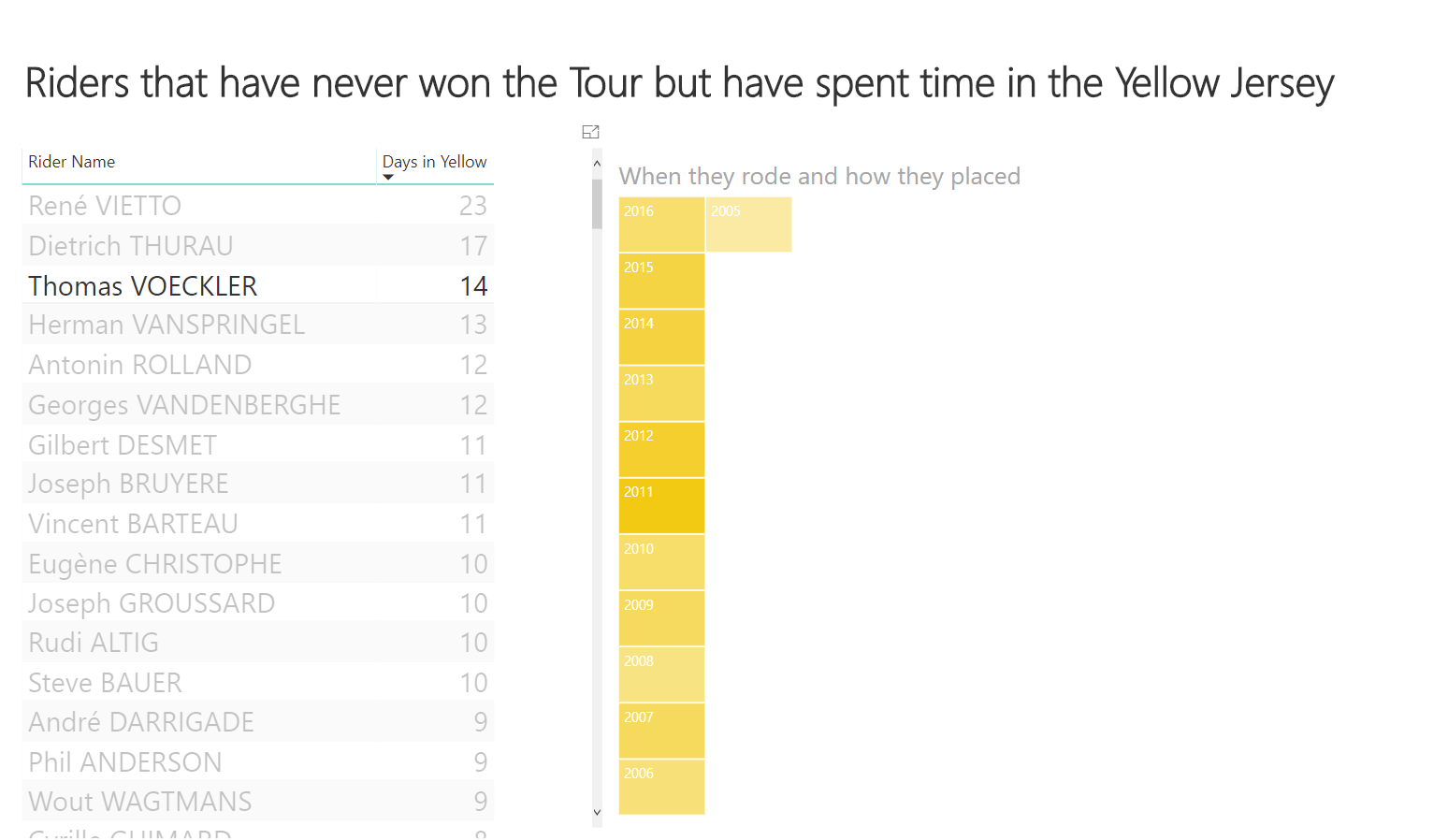
The Future
This is a ‘first stab’ at some visualisations. I want to develop this over time and think of new ways of presenting data. I’m limited a little bit by the software and dataset but both will improve over time. If you have ideas interesting ways of presenting this data please let me know in the comments below!

It is been a tradition in our home to watch The Tour! My father was a big fan and sports addicted! Thank you for information!
LikeLike